Microsoft Power BI Consulting Canada
Microsoft Power BI for Dynamics 365
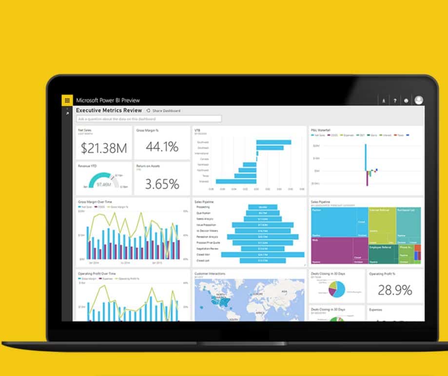
Quick insights and analytics allow for better decisions
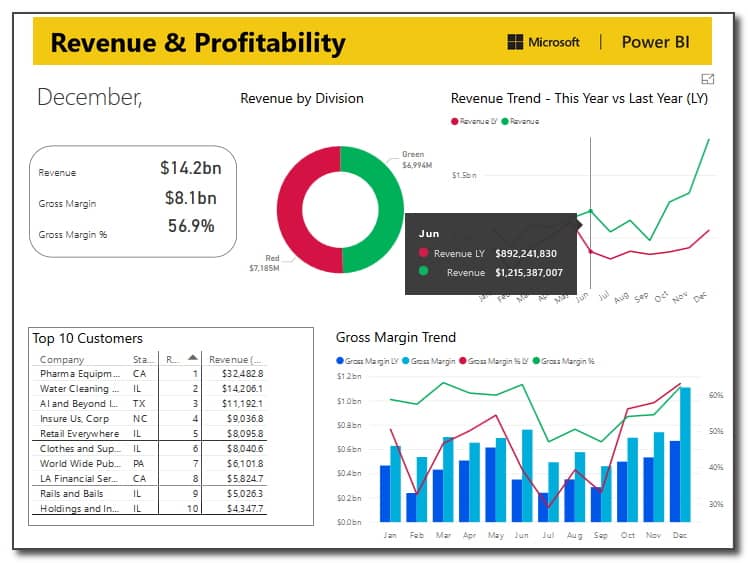
Power BI is Microsoft's flagship analytics platform for KPIs and dashboard reporting. Endeavour can work with you to create a "Data-Culture" where end-users are encouraged to make better decisions based on quick insights and analysis based on real-time data. Business intelligence assists in making data-driven decisions by utilizing data infrastructure, tools, and best practice benchmarks.
Guiding principles for Power BI include:
- Self-serve analytics for everyone Unified platform for enterprise Business
- Intelligence Big data analytics with Azure Data Services (including IoT and Dynamics 365)
- Pervasive artificial intelligence for BI
Endeavour deploys Power BI as a stand alone or embedded application within the Dynamics 365 platform (Business Central, CRM and Common Data Service), PowerApps, Flow, Microsoft Teams, SharePoint and Office 365. Power BI can connect to over 200 different data-sources and serves as a streamlined means of aggregating data and information across multiple systems. Based on your needs, Endeavour can deploy Power BI as a robust Cloud application integrated via the Power BI Gateway to your on-premise SQL Server databases, Dynamics CRM on-premise, or Microsoft Dynamics GP ERP.
The past 2021 Summer release of Power BI Desktop app connected to Business Central using API replacing web services and was 20% FASTER!
The current 2025 price for Power BI Pro in Canada is $13.60. Power BI Premium (approx $6,400 per tenant or $25.60/user) is a viable option for larger Enterprise organizations with 500 BI users or more, and or those who strive to integrate massive datasets from IoT, Big Data and high volume transactions.
Common Power BI Services
- Security setup and deployment
- Integration of Power BI to SQL Data Mart
- Incremental Refresh options
- Merging tables, queries, consolidation of data and star / snowflake data designs
- Dashboard design
- KPI and metrics development
- Advanced visualizations and 3rd party PowerBI apps
Getting Started with Power BI
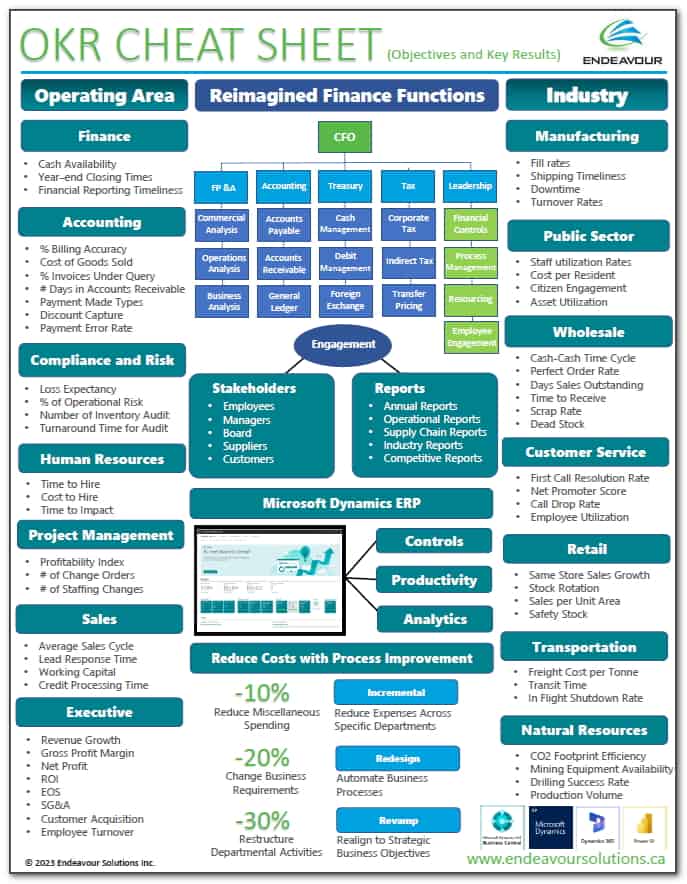
Free PDF Download: OKR Cheat Sheet for top KPI and ORKs
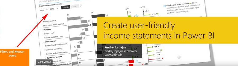
Power BI video by Endeavour Solutions - Power BI Consulting Canada
- Dynamics 365 Business Central, Dynamics GP and / or Dynamics 365 Sales (CRM)
Power BI update
Endeavour Solutions is in the top 5% of Microsoft Partners worldwide with Canadian offices in: Toronto, Halifax (Bedford), London, Ottawa, Edmonton , Vancouver and Montréal with remote support to the USA.
Our success is due to our focus on our customers, our people and our core values of
integrity, trust, and accountability.
Contact us for Free Sample Data-sets for Microsoft Power BI (viewed online or downloaded *.PBIX file)
- Sales and Marketing
- Opportunity Tracking
- Customer Profitability
- Retail
- Supplier Quality
- Human Resources
- IT Spend Analysis
- Procurement Analysis
- Financial Analysis
- Business Central ERP dashboards
Contact Endeavour today.

Steve Ewing
Vice President - ERP, CRM & CloudContact Steve and his team to talk about your Business Needs.
"Let's find a fit between your needs and our Professional Services for Microsoft ERP, CRM & Cloud solutions."

Pro-Tips & Tricks on using Visualizations in your Dashboards and Presentations.
The Prophix team has shared the following tips & tricks for effective presentations.
Data visualization tips
The best charts are the ones that share key metrics and business trends in the simplest way. The goal is to share pertinent information but not overwhelm meeting participants with unnecessary nuances. If it’s going to trigger more questions than insights, leave it out of your presentation.
Design for data visualization
When it comes to data visualization, keep it clean. Opt for simple charts that allow the numbers to be the stars. Choose colors with sufficient contrast to provide visual pop and to emphasize key points. It is also key to steer clear of visual distractions such as shading, borders, gridlines, and 3-D perspective. But don’t let your quest for sterility impede clarity: be sure to include descriptive titles, simple legends, and trendlines to aid in understanding.
Types of data best suited to which type of visualization
While it may be tempting to experiment with chart types, it’s usually better to stick with the basics. In most cases, simple line and bar graphs will suffice. They are not only effective for plotting key data but are easily understood by most professionals. Here are the most common chart types and best use cases:
- Bar graphs are the go-to for single data series, such as customer orders by day.
- Line graphs are optimal for for multiple series of closely related data. For example, one application may be to show monthly spend by division.
- A combo chart that overlays a line graph on a bar chart is an effective way to combine two very different data sets—such as dollars and percentages—into a single chart.
- Area graphs can be compelling when showing cumulative data for several data series. A typical application may be to show product line revenue against the overall revenue.
Learn more about Endeavour and Corporate Reporting